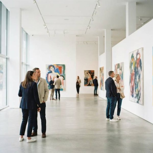
Walk into any major gallery today and you will hear a dozen languages before you reach the first painting. Art travels well, but the words around it do not always follow. Wall labels, audio guides and catalog essays decide whether a visitor leaves inspired or simply confused. For living, contemporary art, that language layer matters even more.
Why Visitors Need More Than Pictures
A painting can move people without a single word, yet context deepens the experience. Who made it, why the colors feel angry or calm and what the artist wanted to say are questions every visitor asks. When those answers arrive in a language the visitor does not read, the gallery loses part of its audience.
Tourists are only one group. Many cities have large communities that speak Italian, Spanish, Arabic or Polish at home. An exhibition that speaks several languages treats every neighbor as a guest, not an outsider.
Start With the Wall Text
Wall labels are the most read text in a museum. Keep them short, direct and free of academic jargon. A label that works in two or three sentences is far easier to translate well than a long essay packed with idioms.
Plan the layout with extra space. Some languages need 20 percent more room than English, and German or Finnish compounds can stretch a line unexpectedly. A designer who knows this early avoids cramped text and tiny fonts later.
Audio Guides and Digital Tools
Audio guides reach people who prefer listening to reading. A calm voice recorded by a native speaker feels like a personal tour, and it works well for visitors with low vision. Record separate scripts for each language instead of reading a translation aloud, since sentence rhythm differs.
QR codes next to artworks let visitors open longer notes on their own phone in their own language. Keep the pages light, test them on slow connections and avoid forcing people to download an app.
Working With Specialist Translators
Art vocabulary is subtle. Words like composition, patina or chiaroscuro carry exact meanings, and a generic translator may flatten them. Choose linguists who know the field, or at least give them a glossary and images to work from.
Exhibitions with strong ties to Italy, for example, often depend on Italian translation services for artist statements, press releases and catalog essays, because the original texts are full of references that need careful handling.
Translation as Creative Work
Translating about art is itself a creative act. The translator reads a description, imagines the work and finds words that make a reader see it too. A flat, literal version can drain the energy from a vivid paragraph.
This article on translation as an art and a science explains why the best results come from balancing accuracy with style, which is exactly what exhibition texts need.
Learn From Leading Institutions
Large museums have spent years refining multilingual visitor services. The Tate offers a good example of how clear wording, accessible design and layered information can serve very different audiences in one building.
Smaller galleries can borrow the same ideas on a modest budget. Start with the most visited rooms, translate the key texts into one or two additional languages and gather visitor feedback before expanding.
Press, Social Media and Online Reach
An exhibition lives beyond its walls. Press releases, social posts and online galleries bring new people to the door, and each should work in the languages of your target audience. Keep the tone consistent, and make sure dates, addresses and opening hours are identical everywhere.
Short video clips with subtitles perform well on social platforms. Subtitles also help viewers who watch without sound, which is common on mobile.
Budget and Timeline Tips
Build translation into the project plan from the start rather than treating it as a last minute task. Texts should be final before translators begin, because late edits multiply cost and risk errors.
Ask for a review by a second native speaker before printing. Reprinting an entire set of labels is far more expensive than a short proofreading round.
Final Thoughts for Curators
Language is part of the design of an exhibition, just like lighting and layout. When texts are clear, warm and accurate in several languages, visitors stay longer, ask better questions and tell their friends. Treat translation as a creative partner, and living art will find a much wider audience.
Accessibility Matters Too
Good multilingual design overlaps with accessibility. Large type, high contrast and plain language help everyone, including visitors who read in a second language. Offer easy-read versions of key texts and consider large print booklets at the entrance.
Seating areas near important works give people time to read and reflect. A tired visitor skips the text, but a comfortable one often reads every word.
Measuring What Works
Count how often each language version is picked up or scanned. Ask a few visitors to explain a label in their own words, which quickly shows whether the translation communicates the intended meaning. Small tests like these guide the next round of improvements and justify the investment to funders.